Showing posts with label Skipping Stones Design. Show all posts

Wednesday, May 9, 2012

Gingham and a Sketch

I'm taking on the Gingham Challenge over at Moxie Fab World: http://www.moxiefabworld.com/2012/05/card-creations-week-gingham-challenge.html and used this sketch at Skipping Stones Design:
The sketch is from Heidi Van Laar and really makes a sweet card. Now for the Gingham Challenge we are to use gingham in an innovative way. Now I don't know if I used gingham in an innovative way but here is my card:
 I wanted to use a color scheme that I have never used before and decided to go with dark gray, light blue and yellow. The gray cardstock is embossed with Swiss Dots EF. The gingham is ribbon that I've had forever. The white heart scalloped border is a punch from Martha Stewart. I layered a narrow strip of light yellow cardstock on top of the ribbon and trimmed the one end into a v shape. I thought it needed a little something more so I took a silver pen and did pen stitching around it.
 The flower and leaf stamp is from Papertrey Ink and I used Faded Jeans and Peeled Paint Distress inks. I layered the flowers by using 1/4" foam adhesive and used a light yellow pearl in the flower's center.
 The sentiment I stamped on yellow cs with silver ink and embossed with silver embossing powder which I haven't used in such a long time.
I really like using gray instead of black or brown for a neutral color. I think it helped to soften the card.
Thanks for stopping by. It's hump day so the weekend isn't far away.
Teresa

Monday, May 7, 2012

Aged To Perfection

Just a quick post today. I just made this card this morning and I need to get it in the mail soon.
The sketch challenge I used on this card is from Skipping Stones Designs http://skippingstonesdesign.com/may-designers-and-a-new-sketch-challenge-126
And here is the fun card I came up with:
 The corner punch is from Creative Memories. I was looking for something masculine as the card is for a man and thought the squares were just the right touch. I wasn't going to use a border but it just didn't look right without a border punch so I used the scallop which to me isn't manly but I had to go with it.
 Paper pieced the wine bottle and stamped the wine glasses on vellum with black Staz On ink.
I love how the bottle and glasses turned out. On the inside of the card it says "Aged to Perfection"
On the front of the envelope I stamped a bunch of grapes that also came with the stamp set.
Well Gotta  run and get this and my Mother's Day cards in the mail.
Have a great day!
Teresa

Saturday, April 14, 2012

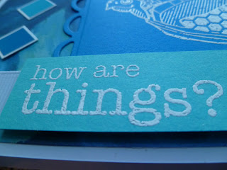
How Are Things?

 Good morning! Just here to share a couple of cards before I start the day. This first fun card was inspired by the Skipping Stones Design Sketch by Dina Kowal:
And here is my take on the sketch:
 While browsing through my stamps I came across this cute turtle image and sentiment and thought it would make a fun card paired with the sketch.
 I used white embossing powder for the image and sentiment . I like the way it really makes the turtle stand out against the blue.
The small blue squares are stickers and I backed them with white cardstock. The pattern paper, cardstock and stickers are all Creative Memories. I wish the photos had turned out better but I think it was just too much blue and not enough light to show the contrast. The colors are prettier than what the photos show.
 My second card was inspired by a sketch I found here: http://freshlymadesketches.blogspot.com/2012/04/freshly-made-sketches-30-sketch-by-tui.html
 
I am starting to make 4th of July cards for From Our Hearts. They send the cards overseas to our troops for them to send home to their family and friends to keep in touch. I thought this sketch would be great to start with.
So please tell me do you think the star looks funny with part of it chopped off? I can't decide if I like it or not.
Sooo many things happened while making this card and I had to go in a different direction. I wasn't planning on going with an aged and distressed look but when I ran the card through to emboss the background it cracked the paper and it has a white core. So I just went with it and sanded the whole thing.
Next I was inking the sentiment when I accidentally put a crease right in the middle. I didn't want to start over so I crunched the whole thing, flattened it back out and inked it some more.
 Then I realized the blue star borders where too bright so I inked them too with Vintage Photo distress ink and roughed up the edges. Problem solved. I also had to age the white star with Antique Linen and Vintage Photo.
I spritzed the star with Perfect Pearls to give it just a touch of glimmer. I ended up liking the distressed look just not sure about the star.
Have a great weekend and thanks for stopping by.

Friday, April 6, 2012

Thinking of You

Wow, I am on a roll this week. Another three cards and I played in five challenges! Here is the sketch I used for my third card:
It is from Skipping Stones Design and this is my first time using a sketch from them.
I used this color challenge over at City Crafter:
Using five colors was really a challenge for me. I found the secret is to use most of the colors in small amounts. I wasn't able to actually enter my card in  this challenge though as it was already over by the time I got around to making my card.
So here is my card:
The card base was a light pink so I used the dark pink for a mat and embossed it with the Swiss Dot embossing folder. The square background cardstock is Peeled Paint and I also ran them through an embossing folder.
This new cling stamp from Hero Arts is my new favorite stamp and I couldn't wait to use it. Hero Arts is one of my favorite stamp companies. They make such good quality stamps. I am also entering the Play Favorites challenge over at the new blog:http://ablognamedhero.blogspot.com/2012/04/challenge-1-play-favorites.html. It is their first challenge so go over there and check it out and see what it is all about.
I first stamped the image using VersaMark Ink on white glossy paper then embossed the image with white embossing powder. Next I inked the image with Spiced Marmalade Distress ink then used a spellbinders die to die cut the image.
 Here you can see I used pop up dots. The only blue I used was in the flower. The sentiment is stamed in black ink and the edges are inked in Peeled Paint distress ink then tucked under the flower.
I love pink and green together but I wasn't sure I was liking these shades of pink and green. But in the end it all came together. I really like this sketch as it is clean and simple not a lot of layers to it and was quick to make.
Thanks so much for visiting and I wish everyone a Happy Easter weekend!